 18th Century
Eearly Dresden and Meissen
NB: Later Meissen Marks (20th Century on) are usually printed on Transfer Printed Wares
 18th Century
NB: Later Meissen Marks (20th Century on) are usually printed on Transfer Printed Wares
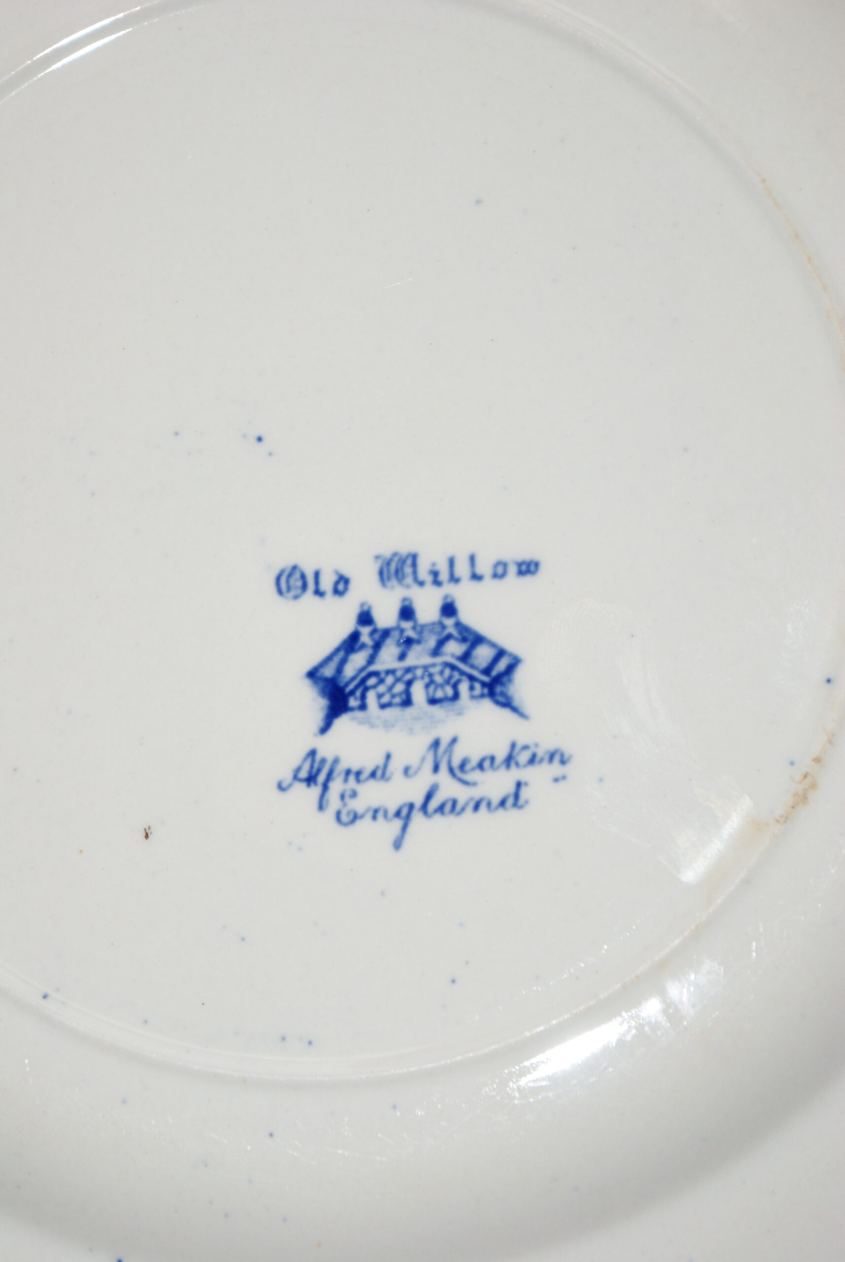 20th Century

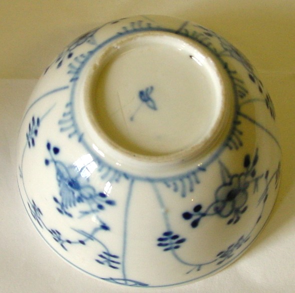 18th Century
Limbach Thurungia, Germany. Late Eighteenth century. Typical hand drawn clover mark used after 1788. The factory closed in the middle of the 19th Century. This teabowl pattern is not unique to the factory – but the quick strokes and confident decoration is. They specialised in quickly produced, simple wares.
The teabowl’s large size fits with it being late eighteenth century. As the tax on tea was lifted and tea became cheaper to import – Tea drinking vessels (which had been small to savour and not waste an expensive and precious commodity) became larger and larger – just as tea caddies went from incorporating locks – to simple lidded boxes and jars.
Limbach factories using this mark included:- Greiner (1778-), Groszbretenbach (1788-), Kloster-Veilsdorf (1797-) and, according to Cushion, it may also have been used by Ilmenau 1786-1792.
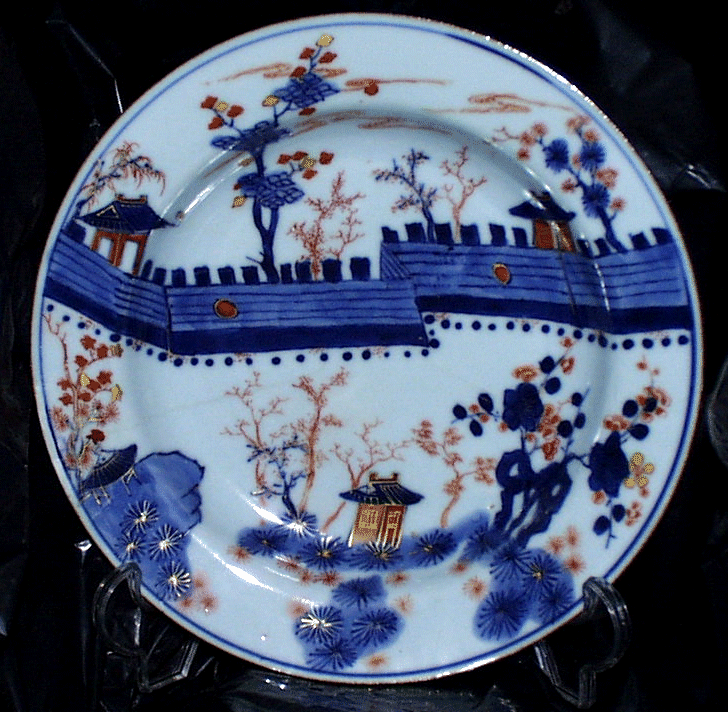 17th Century
When the Ming dynasty fell in the late 17th Century, the Dutch East India Company needed to find alternative sources for importing Porcelain in bulk to meet the increasing demand in the West. Japanese porcelain, shipped from the port of Imari, was cheap bright and colourful – in contrast to the plain blue and white from China – Imari’s most noticeable export was blue and white underglaze, embellished with gold and iron red decoration. The port name, Imari, is now synonymous with this type of decoration (some Arita ware looks similar but does not include the underglaze blue). Below, this good example of 18th Century Japanese Imari is typically distinguished by the dullness of the gold embellishment, the deep dark Indigo Blue that borders on black (frequently applied with a thick brush) and the dull orangey-red thickly (and, again, often crudely applied) surface glazed colouring under the gold.
![<a title="By No machine-readable author provided. N@ldo assumed (based on copyright claims). [CC BY-SA 2.5 (http://creativecommons.org/licenses/by-sa/2.5)], via Wikimedia Commons" href="https://commons.wikimedia.org/wiki/File%3AImariA.JPG"><img width="256" alt="ImariA" src="https://upload.wikimedia.org/wikipedia/commons/b/b0/ImariA.JPG"/></a>](https://marksonchina.com/marks/wp-content/uploads/2017/03/ImariA.jpg)
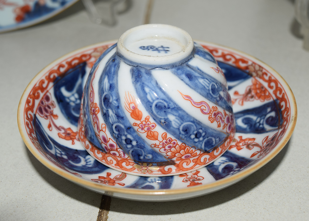
Most early Chinese Imari style patterns tended to anonymous flowers, pots and random “anonymous” patterns – typically ‘Chinese Imari’ is distinctive for its delicacy – the porcelain is thin and fine – almost brittle.
This small chinese teabowl and saucer dates from around 1740.
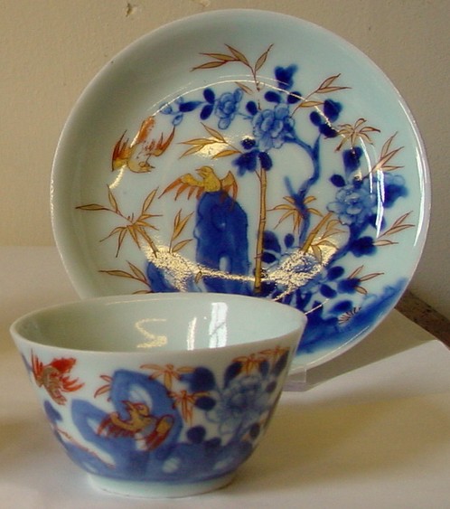
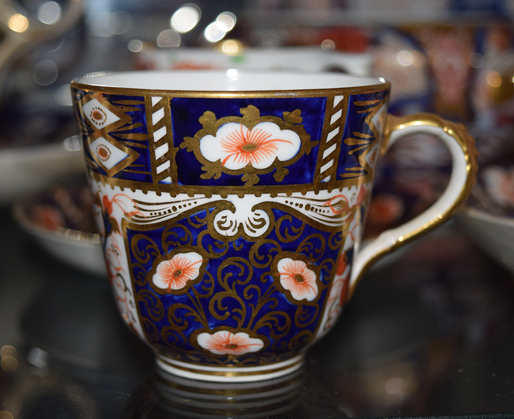
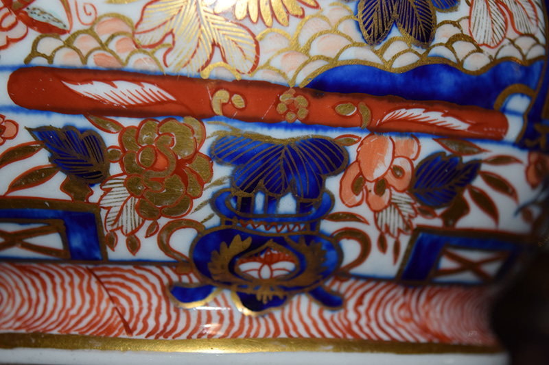
Like the Japanese designs, the bulk of patterns tend to focus on flowers, leaves and abstract patterns. The bright colours aged well and a hundred years later, the burgeoning English Porcelain manufacturers used the bright bold flower and abstract patterns, that typify Imari ware, in their own products. English Imari ware has been produced continuously, since it was first introduced – some patterns have also stayed, broadly the same for nearly 200 years.
For comparison – below is a photo of the wall at Badaling, showing the key features on the plate.
 Photo by CEphoto, Uwe Aranas / , via Wikimedia Commons
 19th Century
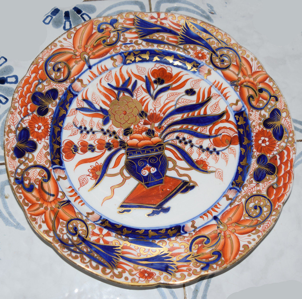
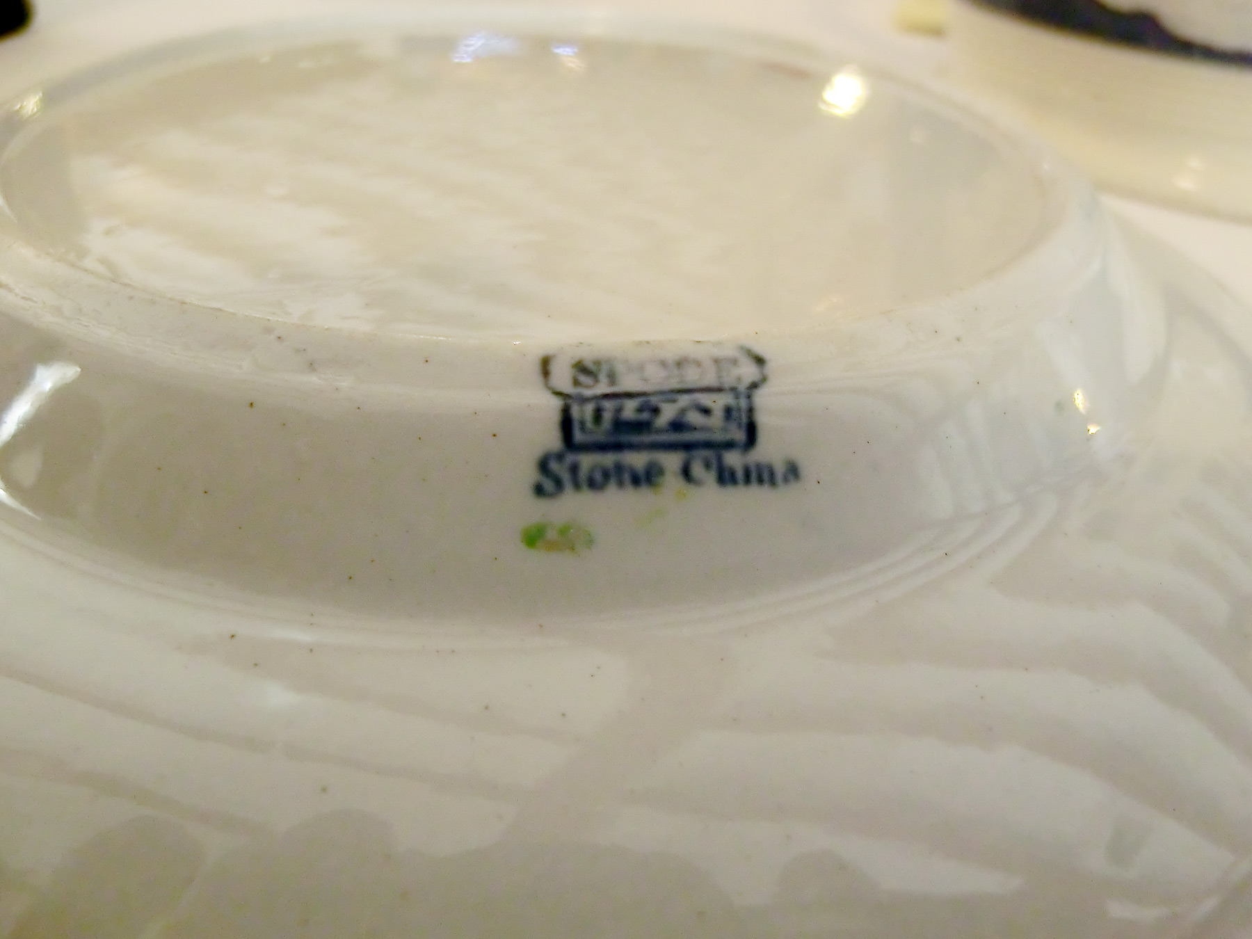
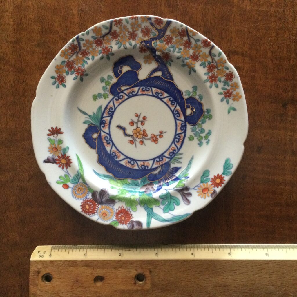
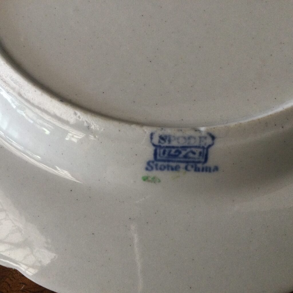
Spode reputedly bought William Turners Stoneware patent some time during the second decade of the Nineteenth Century, with items classed as stoneware appearing from around 1815. Experimentation with Felspar and other additions to the formula saw a patent for “New Stone” filed around 1821, with pieces primarily featuring oriental style designs appearing by the following year. When Copeland Garrett took over the factory in 1833, the mark was retained. Pieces of this style and with comparatively early pattern numbers like the one illustrated below fall into the early and original Spode New Stone era and this plate dates from around 1822-1825
 19th Century
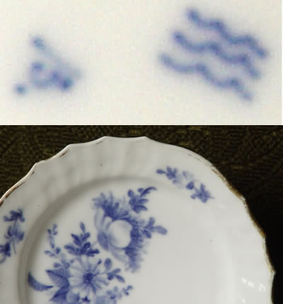
Royal Copenhagen has used the three wavy water lines to identify their porcelain since it started in 1775 – Early pieces frequently include a dot in front of the waves. The mark was not very consistently drawn, often with quite flat waves that look quite rushed- presumably each workman had their own slight variant until about 1820.
Hand drawn lines usually indicate manufacture before 1885. The example to the left is pre 1840.
Between 1885 and 1890 the lines are more uniform – either done with a three nib pen or as a print.
From 1889 a circle was added over the lines – inside which was a crown between the curved words Royal Copenhagen.
From c. 1890, export ware featured a small crown over tiny waves over the word Denmark (spelled in English) in a circle over three larger waves. The circle was dropped from non export marks.
Between 1894 and 1897 a variation of the export mark was used without the circle and the tiny waves, however these are easy to spot as this is the only period in which DANMARK, the Danish word for Denmark, was used.
In 1897 until 1922 the words Royal Copenhagen replaced the circle. Separated with two dots (one each side of the word Royal) the words sit above the three wavy lines.
1923 had two variant marks – one an ornate crown over waves with no text, the other the crown that was used in the post 1923 mark, but over the word Denmark, over the waves.
The printed mark in the bottom picture has been in use with subtle variations since 1923 the principle difference between this and the pre 1923 mark is the combination of the factory name and the country of origin – again spelled in the English way as Denmark. All Royal Copenhagen marks that include text are printed in capitals in a non-serif font.
Dating indicators were first added to the Royal Copenhagen mark in 1935. There were two types – Lines were used underglaze and dots used overglaze, they are quite distinctive and easy to see.
Underglaze Line
Look for a line under or over the letters (note from 1985 the line covers two letters).
Line over the top of the letter – ROYAL COPENHAGEN – R = 1935, O=1936, Y=1937 etc through to N=1949
Line under the letter – ROYAL DENMARK COPENHA – R=1950, O=1951 Y= 1952 etc through to A=1967
From 1968 to 1974 the mark stayed under the G
From 1975 until 1979 the line moved to the E
From 1980 until 1984 the line moved to the N
From 1985 to 1991 the mark covers both the R and the O
From 1992 to 1999 the mark covers the Y and the A
From 2000 to 2004 the mark covers the A and the L
Overglaze Dot
As before look for a Dot above or below the letters – to make life complicated the years run from the end of the word to the front and the words are repeated… so…
Dot under the letter – KRAMNED – K=1935, R=1936, A=1937 through to D=1941
Dot over the letter – KRAMNED – K=1942, R=1943, A=1944 through to D=1948
Dot under the letter – NEGAHNEPOC – N=1949, E=1950, G=1951 through to C=1958
Dot over the letter – NEGAHNEPOC – N=1959, E=1960, G=1961 through to C=1968
Dot over the letter – ROYAL – L=1969 to 1973, A=1974 to 1978, Y=1979 to 1983, O=1984 – 1988, R=1993
So the modern sugar bowl in the picture dates from between 1969 and 1973.
NB There is a separate code for the crown and Denmark mark (that excludes the factory name) which will be covered in another article.